Getting Started
Onboarding into Opal
Opal Training
Opal Overview
StoryFirst Framework
Opal Calendar
Download Opal on Mobile
Navigation
Personal Panel
Notification Settings
Notifications and Subscriptions
Workspaces
Status Icons
Opal Glossary
Web Browsers and Security
Edit Your Profile
Edit Your Settings
Help & Support
Opal Features & Functionality
Opal API
Campaign Planner 101
Best Practices
Save time with Opal AI
Inside Look: How Opal Marketing uses Boards
Content Planning
Campaign Planning
Organize Briefs
Project Management
Executive Communications
Communications
Internal Communications
Paid Media
Social Media
Managing your Email content
Parking Lot for Content
Desktop App
Universal Features
Keyboard Shortcuts
Labels Sets and Labels
Filter, Search, and Sort
Collaboration
Notes
Manage Privacy & Permissions
Track Campaign Budgets
Flighting
Invite Users
Stamp Templates
PowerPoint Export
User Groups
Instant Log-In
Opal Insights
Work with Campaigns
Define Campaign Details
Moment Overview
Create & Manage a Moment
Customize Moments in Week View
Moment View Layouts
Moment Options
Move a Moment
Workflow on Moments
Manage Campaign Content
Content Overview
Channels & Content Types
Create & Manage Content
Content Composer Tabs
Content Options
Content Placements
Content Localizations
Previewing Content
Share Content
Publish Content
Export Content Metadata to CSV
Email Modules
Text Editor
Longform Content
URL Preview
Website Content
Channels & Content Types
Custom Content Channel
Digital Ad
Email Preview
Flickr
Radio
Snapchat
TikTok
Television
VK
YouTube
Embed Content
Opal Docs
Manage Assets
Assets Overview
View the Asset Library & Assets
Upload Assets
Edit Asset Settings
Export Asset Metadata to CSV
Use Tasks & Approvals
Workflow Overview
Use Workflows
Configure Tasks and Approvals
Manage Assignments
Approve and Decline Content
Share the Work
Presentations Overview
Create a Presentation
View a Presentation
Edit a Presentation and Slides
Share a Presentation
Canvas & Title Slides
Integrations
Chrome Browser Extension
Dash Social
Facebook Ads Manager
Firstup
Jira
Khoros
Khoros Admin Guide
Slack
Sprinklr
Sprinklr Admin Guide
Workfront
Wrike
Frame.io
Content Delivery Integrations
Asana
Sprout Social
Formstack
On-Demand Webinars
Opal Essentials
Opal Admin Training
Quarterly Product Showcase: Project Management
Quarterly Product Showcase: Boards & Browser Extension
Opal Essentials - Limited User
Opal Quarterly Showcase w/Lauren Scott of Zillow
Opal Quarterly Showcase w/Angelic Crippen of Intermix
Opal Quarterly Showcase w/Kelsey Dahlager of Target
Opal Quarterly Showcase w/Leah Randall of Minted
Admin
Naming Conventions
Set Up Your Opal for Success
Manage General Options
Manage Label Sets & Labels
Manage Channels & Accounts
Manage Workspace Workflow
User Directory
Manage Users
Role Capabilities
Viewer User
Limited User
Single Sign-On (SSO)
Customer Success
Types
Custom Fields in Plans
See What's New!
Changelog
Discover Boards, Your New Home in Opal
Browser Extension
Simplified & Streamlined Navigation
Nested Label Sets
Stamps
Opal Text Editor
Moment Flighting
Annotations
Your Marketing Calendar, Now on Mobile
Orchestrate & Visualize Your Website in Opal
Email Collaboration Made Easy
Do More In Your Favorite Views
Polished for a Purpose
Workflow In Opal
Workflow Improvements
Content Start and End Dates
Export to PDF
Content Change Tracking
Export Your Opal Data to CSV
Do More with Assets
Enhancing Collaboration with Access
Content Data Export
Added Accountability for Approvers
Facebook Canvas Ads
Plan & Manage Budgets
View & Schedule Timing of Content
New Moment Actions
September Campaign Planner Beta Update
Flexible Content Start Dates
Policies & Guidelines
Plans
Boards
- All Categories
- See What's New!
- Polished for a Purpose
Polished for a Purpose
Opal now looks, and sounds, a bit different! This change goes far beyond appearances. We're proud that Opal is now significantly more accessible, which benefits everyone.
With these improvements, Opal is easier to read with higher contrast, can be navigated more quickly using your keyboard or assistive device, supports screen readers, and has helpful labels throughout. It also simply looks nicer and is more consistent!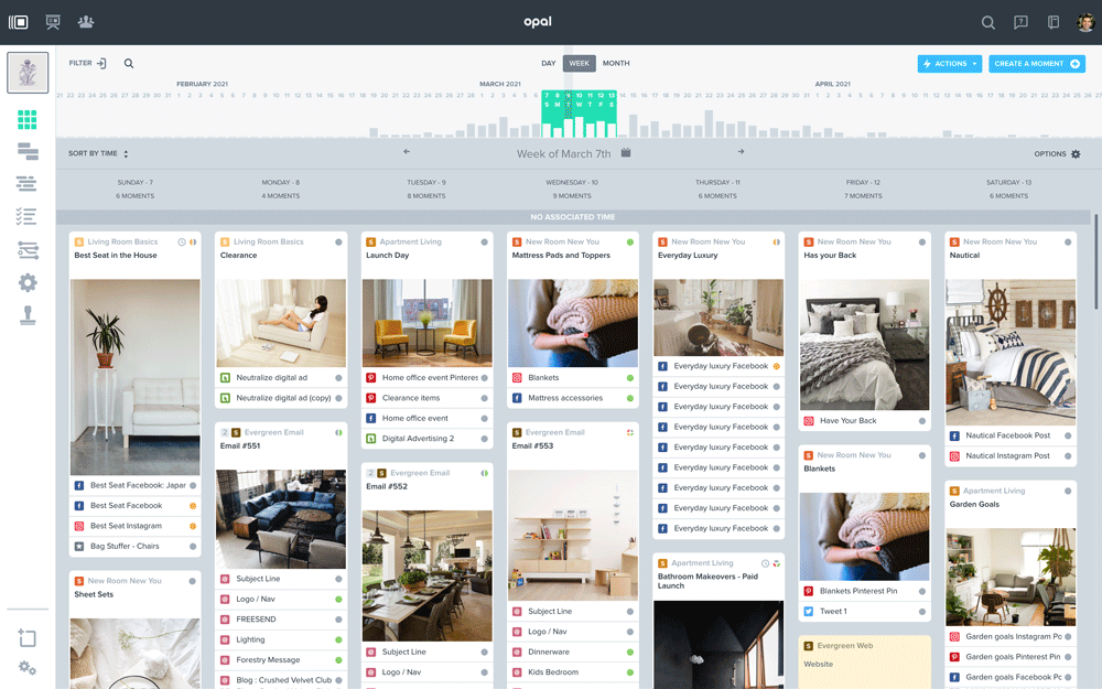 Some of these updates include:
- A refined, cleaner color scheme that provides enhanced contrast to improve readability. Simply put — it looks better and creates more consistency.
- Keyboard controls for navigating Opal, browsing views, completing forms, and much more. This allows users employing assistive devices to use Opal, while also making it faster for everyone to get around.
- Comprehensive labeling to enable screen readers to make sense of Opal. This makes Opal easier for everyone through improvements like clearer form labels.
These changes are all improvements to current functionality. No re-learning Opal is required!
We're proud that this work demonstrates how an accessible product is a better product for all. This is just the beginning of our focus on improving the user interface and experience of Opal over the course of 2021. These improvements are all aimed at increasing Opal's value by making it easier and faster.